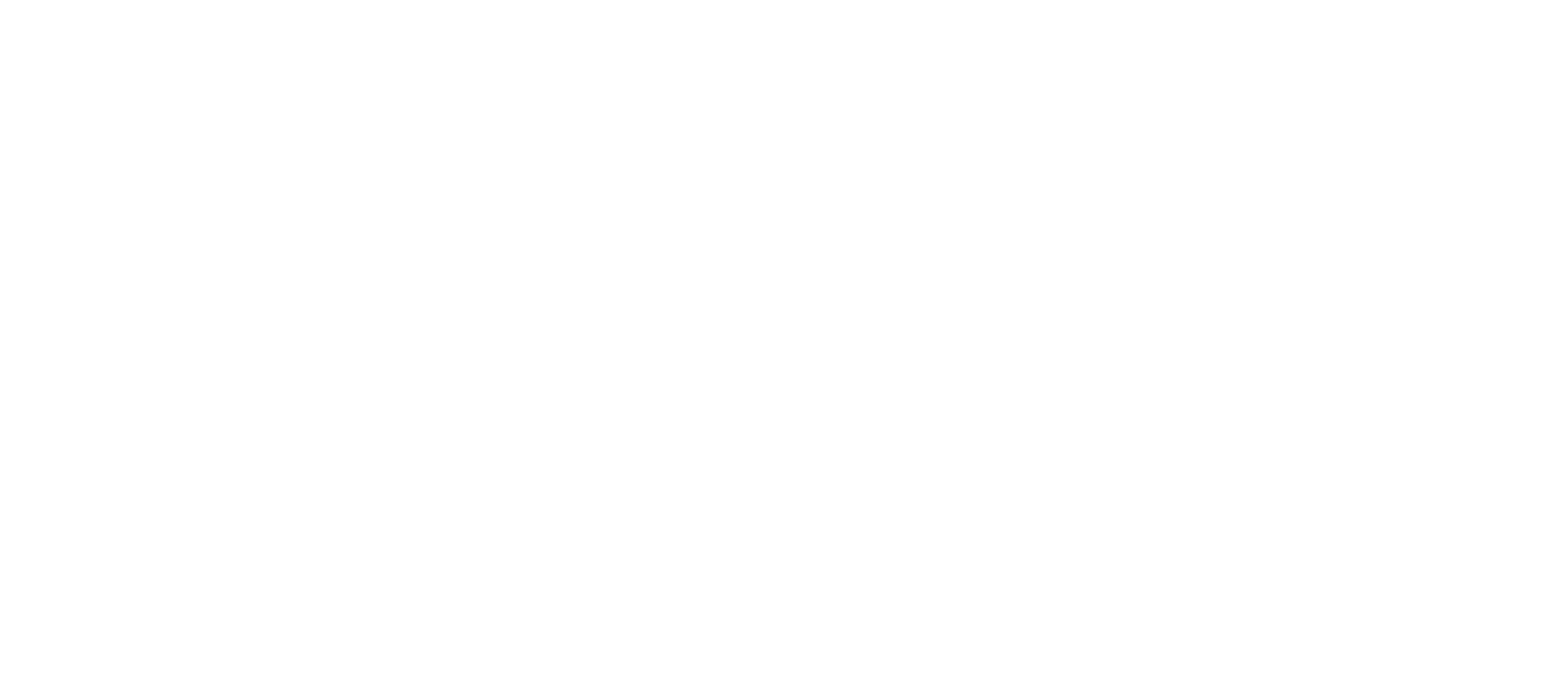
Future Nostalgia
Design Brief:
create a new typeface based on "Futura". The design should be based on an understanding of the classic's historic context/intent, distinguishing features, personality and general structure. contrast and harmony should be design considerations new and classic will be companions.
FUTURA:
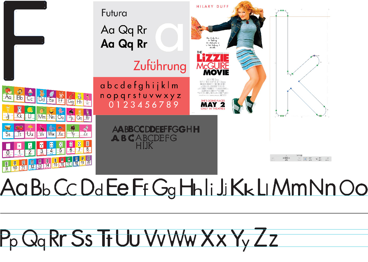
Futura is a geometric sans-serif typeface that was designed by Paul Renner and released in 1927. It is considered a classic of modernist design and is known for its clean, simple, and highly recognizable aesthetic. Futura is characterized by its strict adherence to geometric shapes, particularly circles, squares, and triangles. This gives the font a sense of precision and simplicity. Futura is a timeless and iconic sans-serif typeface known for its geometric simplicity, even stroke weight, and modernist aesthetic. It is widely appreciated for its legibility and versatility in various design applications.
With the creation of this typeface, I focused on creating a bubbly and rounded version of the already existing Futura font, to create almost a nostalgic feel to many being reminiscent of something you would see as a child written. I felt like this would add more simplicity, uniqueness and playfulness to the font, while also keeping the very same geometric feel of Futura.
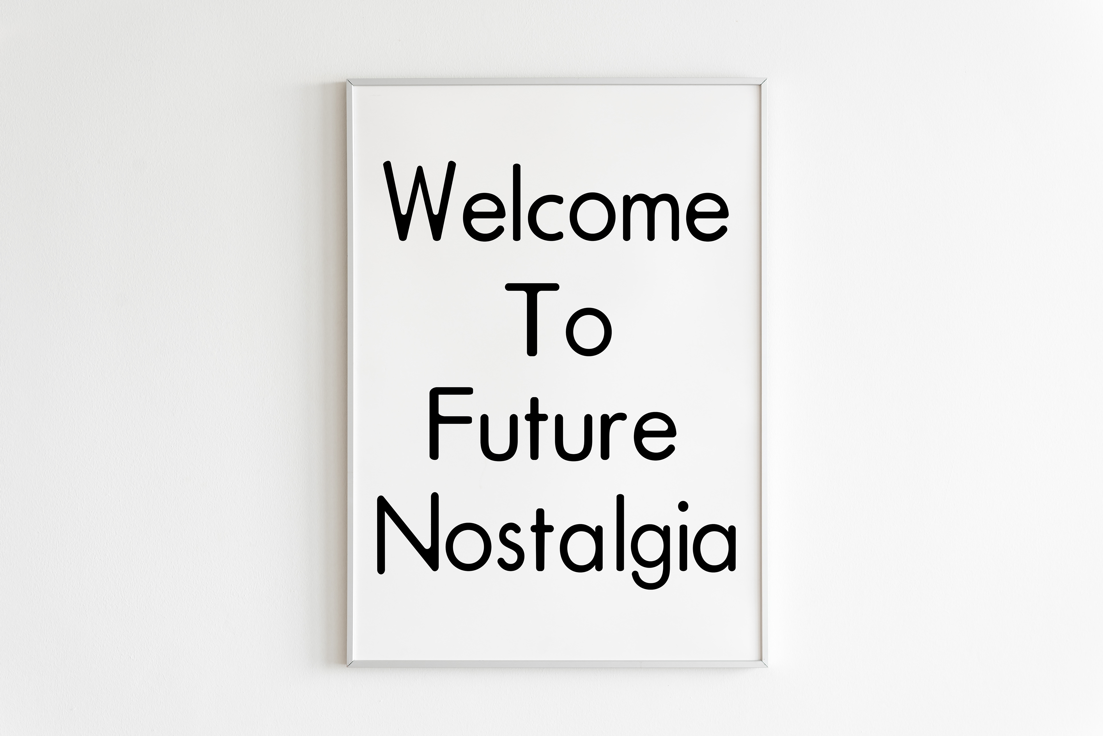
Bubbly: A round and fun attribute that becomes playful and soft.

Geometric: Curvilinear use of lines and figures.

Light: Not heavy and small visual weight


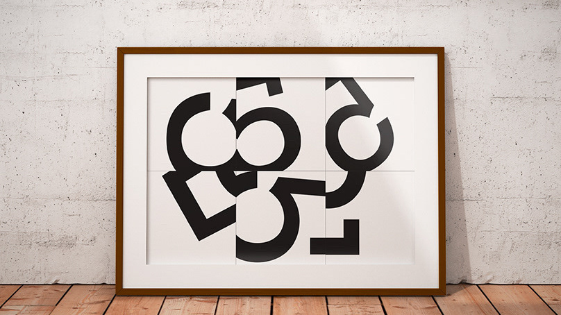
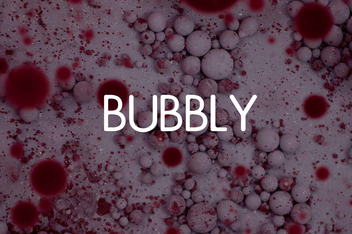
Left: Bubbly, Middle: Geometric, Right: Light

comparison of both typefaces

Left to right: Bubbly, Geometric, Light
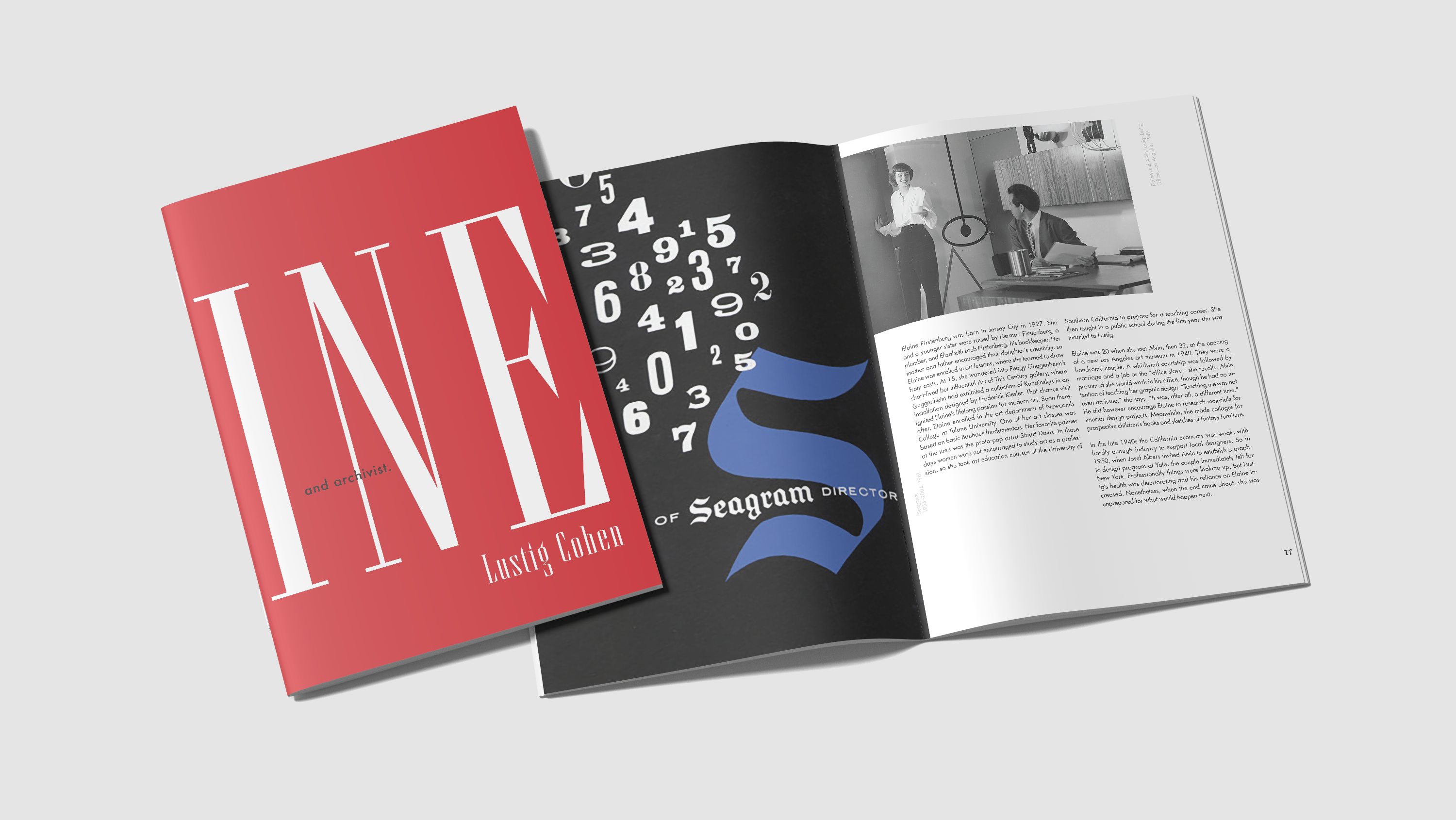
Process of typeface and research